
We’ve covered and emphasized and delved into the whys of good book cover design for the individual book. But what about your second or third book? Even though you attracted readers to previous books, you can’t slack off on the book cover design, hoping your name or your series’ popularity will carry you along. But even if the design from book cover to book cover is solid, completely changing your cover from the first book to the second could confuse the reader. They may start second guessing, asking questions such as “Is this the same author as last time?”, “Uh oh. I hope this book has the same stuff I liked in the previous book.”
When readers buy a book with your name on it, they are counting that the book is the same, if not higher, quality than what they enjoyed the first time. One subconscious way you can hint, “Hey. You liked this book. This one is even better!” is through consistency in design throughout the series. That’s when you start investing in something called branding: giving your book covers a cohesive identity that spans across your entire series.

Even if it’s not the same series, you always know what to expect in a Nicholas Sparks novel.
Now, the Nicholas Sparks example doesn’t mean that you need to make every book you ever write look similar. If you write a fantasy trilogy, then move to writing investigative non-fiction, you actually don’t want your books to look eerily similar (see: Designing by Genre) because it will hurt attracting new readers.
So instead you’re working on keeping your series’ book covers recognizably consistent while still distinct from one another. What should change? What should stay the same?
Typography
Keep the same fonts, same sizes, and even same general placement. If your title is on the top and your name on the bottom, try to keep it like that. For that matter, you should keep that in mind when figuring out the imagery from book to book. If you are commissioning an illustration, give that information to your artist so they know to allow enough space so you can keep your books consistent.
Imagery
Don’t have different styles from cover to cover. (See the types of covers to choose from). Even if your first book was so successful you now have the budget to afford the best artist in the world, don’t change the style. This applies especially to illustration. If you aren’t able to get the same illustrator, find someone who can replicate that style. Or rebrand your series completely so they match.
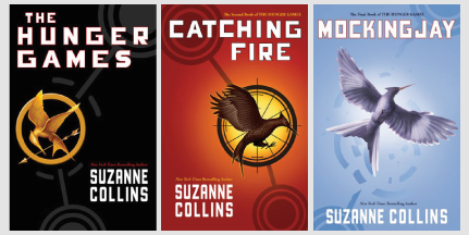
Also, if you suspect you will be writing more than one book in the series, start thinking of imagery that can carry over multiple books. Think about shapes. Think of camera shots (close ups, wide shots, etc). The Hunger Games books are an excellent example of cohesive imagery. Once you’ve seen one book, you immediately associate it with the other books.
Color
Depending on what you decided for your imagery, color can be crucial to your series branding. While the Hunger Games example above changes most of its colors from book to book (except for the white lettering), series like Twilight rely extensively on its color choice. All the Twilight books feature dark red and white. The imagery might change, but as long as its keeping the same color background and striking red and white color scheme, you can still tell they belong in the same series.
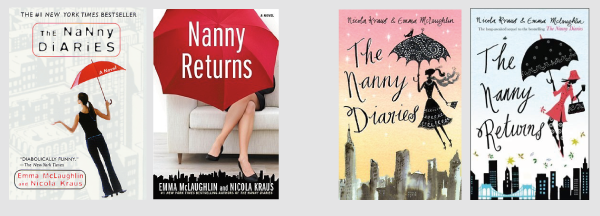
Actual design aside, which edition of The Nanny Diaries says “We belong on the bookshelf together”?
By considering these factors when designing the books in your series, you can develop a strong identity and branding for your series as a whole. When you do that, your book covers work in harmony, showing a potential reader that they can trust you; if they invest time in your books, they’ll walk away for the better.


