“The Cover Uncovered” will be a monthly post where I dissect the cover of a relatively recent book and take a look at what works, what doesn’t, and what you can learn from it.
Non-fiction book covers can be tricky beasts. Most times there aren’t characters or scenery to show off, and it can be hard finding an emotional draw if you’ve written a more practical book. This probably explains the following tendency I’ve observed in non-fiction: slap on a photo related to your topic, add a title and author, then call it a day. And sometimes that’s not a bad practice. If you’ve written an extremely specialized book that people in your field are actively searching for, then that will work.
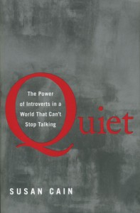
However, if you’re aiming your non-fiction at wider audiences, you should play with the cover and stretch your mind creatively to draw in audiences. Just because it’s non-fiction doesn’t mean it needs a photo. For example, as I write this blog post, there’s a fun little book that’s been on the New York Times Non-Fiction Bestseller the past few weeks. Quiet: The Power of Introverts in a World That Can’t Stop Talking by Susan Cain. As the title suggests, the book seeks to show how the world undervalues introverts and how introverts can thrive in an extrovert-oriented world. So how does the cover convey this? And without the obvious answer of a photo of an introvert reading a book while being harassed by extroverts?
Ta Da!
Color & Background:
This should a simple one to analyze, right? The background is a dull, grungy gray, which allows the red text to stand out against it. Or does it?
Let me pull you back to relive what was hopefully a fun time in your life: art class. One of the principles of art as well as of design is something called value. Value is essentially (wait while I pull out dusty school material from a folder) “the lightness or darkness of a color.” Since my school material is a little lacking in explanation, I guess I’ll need to fill in the blanks.
Every visual element in your book cover has some percentage of black in it. Two colors may appear completely opposite, but if the values of two colors are close in percentage, the shapes won’t contrast well and will seem to flatten. Conversely, if the percentages of the value are far apart, the two colors really stand out against each other (think of a light blue bird on a dark green background). So what does this have to do with Quiet? Sometimes, designs look amazing in color, but when pulled into grayscale, lose their impact.
Case in point:
See? The value of the red in Quiet is so similar to the value of the gray background that the title blends into the background. In most cases, I would suspect, given the size and prominence of the Q in “Quiet”, that the designer wanted the title to stand out, and therefore made a mistake in choosing this particular value of red. However, since the subject matter of the book does involve introverts living in a world made for extroverts, this could actually be a clever extra by the designer that would make the word retreat into the background a little and in fact reference the content of the book. Who knows? Maybe I’m reading too much into a color. This should, however, prove to you that attention to even the smallest of details can help convey something about your book.
Typography
Instead of picking a bold sans serif typeface, the designer opted for a simple serif typeface that also helps underscore the quiet nature of people inside in the book. An effective choice of typography and one that serves the book cover well.
Composition and Graphical Elements
Not too much to say here. Sans typography, there are no real graphical elements in this cover. The composition is minimal, simple and clean which allows the title, author’s name, and description to stand out. I’d like to note that just because I don’t have much to say on this doesn’t mean it’s bad. Often a simple design can say it best and anything extra would be clutter.
All in all, I wouldn’t say Quiet definitively shows off the content in its cover. If you were to remove the subtitle, I’m not sure if you’d be able to guess what the book was about. Quiet does demonstrate, however, that you don’t have to feel limited to sticking with stock photos if you have a non-fiction book. Just a quick glance at the Goodreads Best Choice for 2012 Non-Fiction or the Christian Science Monitor’s best Non-Fiction 2012 shows there’s often a lot of creativity in typography in the non-fiction covers, even the ones that predominately feature photographs. Using all your design elements from typography to color to photography in the best way possible helps improve your cover.
Rachel Giles is a professional graphic designer who graciously donates her time to the Consortium. Every Tuesday she shares an article about quality cover design.


