
Every now and then, I decide I want to be stylish. I’m able to dress myself reasonably well; it isn’t all superhero emblem t-shirts and blue jeans. I  have some nice dress shirts and good-looking sweaters. I’ve been known to rock the fedora and the newsboy cap. I own more than one pair of Chuck Taylors and in multiple colors. But now and then, I decide to get serious.
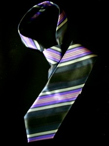
I don’t usually stick with it. I don’t really have the budget to do it right nor do I have the patience to do it on a budget. But the last time I did this, I realized that fashion had, in one sense at the very least, left me behind. It had become fashionable for men to wear print shirts with print ties.
Ah hell naw.
Solid shirt with pattern tie or vice versa. Even if a couple of the colors match or are complementary, anything else looks to me like you dressed in the dark. And honestly, I’m not sure this is a prejudice I’ll ever get over no matter how long the fashion persists.
 Shirt and Tying This Together
The three key elements on a book cover (or its virtual equivalent) are the Title, Graphic Design, and Promotional Copy. If you get lucky or famous, the Author’s Name may join these elements as equally or even of greater importance. It’s also worth noting that there are sub-divisions of information under each of these (see Rachel’s wonderful posts for more on the design), and that the Title and Graphic (and, after luck or success, Author Name) are often tied together intimately.
But even with these caveats I’d still say these are the bare minimum elements of a cover. And as we discussed, a cover’s job is to sell the book. They don’t have to read it (again, it’s very nice if they do), but the customer does have to get intrigued enough to pull the trigger on a purchase. And they all have to complement one another.
In the same way that I shouldn’t wear striped pants with a checked sport coat over a plaid shirt and paisley tie, these elements cannot be in competition with each other. If I saw someone dressed like that, it could honestly hurt my eyes. I’d certainly stop looking at them as soon as humanly possible. In the same way, if you give me a cover with what looks like an oil painting of a hairy-chested love god combined with a title like Jelly Donuts and promo copy that reads like Civil War era historical fiction, I’m going to stop looking at it before it causes me permanent, mental damage.
The elements aren’t working together to create a cohesive idea of what the book is about. This will cause a thing psychologists call “cognitive dissonance.” Cognitive dissonance is used in all kinds of ways in marketing, but not typically when you only have a split second to sell something.
Avoiding the Dissonance
You can read the entire Wikipedia article on cognitive dissonance (and you should, it’s fascinating). But the most important bits for this discussion are these:
- A key assumption is that people want their expectations to meet reality, creating a sense of equilibrium.
- Likewise, another assumption is that a person will avoid situations or information sources that give rise to feelings of uneasiness, or dissonance.
If your cover becomes a situation where it’s impossible for a potential buyer to create an expectation that might meet reality (say, with my insane cover example above), they’re going to get psychologically uncomfortable. They will then proceed to ignore it as quickly as possible. That is very different than taking the plunge on a purchase.
These key elements of a book cover have to share the burden of explaining, very nearly at a glance, what the book is about and why potential buyers should care. If they don’t work together or, worse, work at odds with one another, then the marketing of your cover will fail. What’s more, it will force whatever other marketing initiatives you put in place to work that much harder just to overcome the mistakes of the cover.
Please, people, don’t dress your book in the dark.


