Remember last week’s article about the shape of a document? Remember that hideous image growling out at you halfway down the scroll?

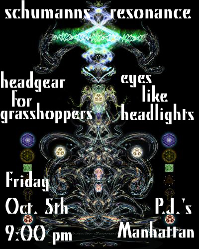
Band flyer for Eyes Like Headlights at P. J.'s
GAH! Yes, that one. Man.
Well, this week your assignment is to do one better. Take a few lines of mostly nonsensical words, and turn them into something meaningful. Not just that, but something that sells. Something that makes a casually glancing passerby want to spend their Friday night at some dingy bar just to see what your band is like.
Graphic design is a real tool of the Technical Writer’s trade, and as more and more of our everyday writing goes online — and as the internet becomes more and more a visual medium — the ability to blend images and text to work together in conveying a message becomes a pretty big deal.
So get some practice. Here’s your words:
www.myspace.com/eyeslikeheadlights
eyes like headlights
cd release party
debut album
there’s no us in evolution
5909 johnson drive
mission, kansas
with left on northwood and rettig
friday, october 26
the mission theatre
all ages 21 to drink
As I told my students, you could probably find the original flyer these words came from with a little snooping on the internet, but that’s not what I want to see. I want to see your best effort, I want to see how you communicate in a mixed medium.
If you don’t have a clue where to start, I’d recommend Flickr. Search for a background image that sparks your creativity, and then copy it into Photoshop or Picnik or Paint, or even Microsoft Word. Use the tools you know, and make it as compelling as you can.
Then share it with us in the comments. I can’t wait to see what you come up with!


