Yesterday, you’ll recall, I talked about customizing the appearance of standard-styled text in Google Docs. If you follow me on Twitter, you might have caught some chatter after that post went out between me and a professional editor who took issue with some of the screenshots.
Before you rush to my defense, I should point out that her only goal was to make sure you, my readers, get sound advice. She mistook my technical instruction on how to adjust the way your text looks for style advice on what it should look like.
And she rightly pointed out that sending in a document that looks like the one in yesterday’s screenshots wouldn’t do you any favors with a big-name New York publishing house. If you’re trying to submit to the publisher she works for, for instance, it should all be Times New Roman (even the headings), and 12 point, double-spaced, with no special characters.
Adjusting Your Local Styles
Now, personally I’m less and less of the opinion that writers should be jumping through some of those nonsense hoops for New York publishing houses, but I’ll wait until I’ve got some credentials behind me before I classify that as “advice.”
Her objection serves as an excellent illustration of the point of this series, though. Because I never suggested you change the text in your book to be Century Schoolbook 9-point font, or change the text of your chapter headings to be Arial. I suggested you make chapter headings <H3> and body text <p>, and showed you how to change the styles.
Once you’ve done that, if you find out the formatting you applied was wrong, it’s the easiest thing in the world to go into the CSS and copy the “font-family” line from your <p> tag down into the headings.
I could turn this into another 1,000-word tutorial if I went into all the details, but with a little effort (maybe five minutes, counting Google searches) I was able to match all of her requirements. I went one better and added a styled contact info block at the top and a header with [author’s last name] / [first significant word in title].
So there you go, a beautifully styled document according to one publisher’s very specific standards. I’ve heard from others that it should always be a monospace font, because that’s easier for typesetters to evaluate. No problem! Just change “font-family” from Times New Roman to Courier, and your whole book is ready for that publisher.
Some editors never want to see italics or bold. Instead it should be underlined and all-caps (respectively). Easy, easy! Add two new style definitions to your CSS:
em {
font-style: normal;
text-decoration: underline;
}strong {
font-weight: normal;
text-transform: capitalize;
}
That’s it. You don’t change a word of your document, you don’t scroll anywhere or search for anything. You just open the CSS, add a few lines, and your document is ready to print and send off.
Printing It Out
Of course, the whole conversation is moot, because we’ve been talking about a book written in Google Docs this whole time. Right? And remember that program I mentioned at the start of this series — the one I had to write to take books out of Google Docs and put them in Word so I could style them for publishers’ submission guidelines?
Turns out that original program is entirely obsolete. (Google will do that to you if you’re not careful.) In the time since I wrote my original program, they’ve added a convenient option on the File menu: File | Download as | Word. That’s all there is to it. They’ve got an option for OpenOffice, too, to make your export as clean as possible.
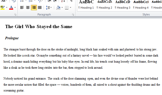
And how clean is that? Let me show you. This is my completely reformatted and styled document that I showed you earlier, once it’s downloaded and opened in Word:
With some slight differences in font and format, that looks an awful lot like one of the screenshots we saw yesterday — the second out of six, in fact.
So is it a failure? Not at all. Because we can do precisely the same thing in Word that we did in Google Docs, and Word has some dialog boxes that actually make it considerably easier. Once you know what you’re doing, the whole process from start to finish shouldn’t take you more than five minutes.
That’s next week’s lesson, though. Come back on Sunday, and I’ll tell you how to make Word make your words look right.


